- The Makery
A naming & branding project for a creative consultancy with a primary focus on hand-crafted models.
- The Makery is a creative consultancy with a primary focus on hand-crafted models, installation design and art direction. Apart from commercial projects, The Makery endeavours to be a provider of workshops for students in a bid to spur creativity within local youths.
As a company that engages in a multitude of services, the challenge was to create a name and a modern, attractive & versatile identity that would do two things:
1. Be muted enough to be applied over a portfolio of works with varied art directions and not steal attention, and yet be strong enough to stand on its own,
2. Allude to its primary emphasis on craft, and yet avoid the common direction that other entities revolving craft would commonly take - no explicit usage of scissors, papercuts, paint, glue & so on.
By working closely with the client, we arrived at The Makery: When one thinks of a bakery, one pictures oven-baked pastries lovingly prepared by hand. The Makery, on the other hand, produces stunning pieces of hand-crafted art.and I believe a really genious one TRAVALENT:Cutting edge technology was used to extract a single tetrahedral cell from a tetrahedral pyramid. After prolonged experiments with multiplication and mutation of the cell, the Trivalent pattern was finally created.With the help of precise analysis mechanisms and data mining techniques, the pattern was further developed and perfected into what we have today in front of us.The logo is adapted for all sizes, keeping the distinct pattern and colors.
logo design etiketine sahip kayıtlar gösteriliyor. Tüm kayıtları göster
logo design etiketine sahip kayıtlar gösteriliyor. Tüm kayıtları göster
11 Kasım 2012 Pazar
Brand identity
Since we are now dealing with brand identity and co-products, I've searched for som brand identitiy works. And these are the ones I like, because their message is clear coherent with their product and they have a subtle beauty. Even in the case of cheesy candle bind, it looks incredibly simple and beautiful.


28 Ekim 2012 Pazar
Glyph: transformation all over again
This week our assignment was to create crazy relationships with irrelevant images, and create a brand that would born from that stream of consciousness. The images that lightened my mind are:

All these images were transformations of forms and shapes, a women so beautiful, rises from a pattern, again a women unifying with a bug, and a bug created with total inorganic substance. And a total different case; a cat as a hat! The absurdness of all these images charmed me a lot, created a lot of stream. first the nonsense of form that is considered to belong to species totally hit me. The thing we are made of or our form can be changed and the image would still be recognizable. all the restrictions about how an image should be seemed un related to me. And that led me to the point of the restriction of how human body should be. How contemporary world imposes perfect proportions to our minds, and at the same time leading the distortion of bodies with less physical working spaces and high caloried unhealthy diets. That leads people to turn the canons of contemporary world to utopias for themselves.
All that stream brought me the idea of full transformation, a center that offers specifically women a get away from their cycles and gives them a chance for becoming what they always envied of not only the case of forms- that is proved to be deceptive- in the case of soul. I created a brand that offers the change in total sense, a health and beauty center. Giving psychological consults, yoga classes, meditation, life coaching, business consultant, finding new jobs, intellectual debates, phsical exercise classes, dietician services, new dish recipes, health consultant, advices about nursery... I visualized a perfect female proportion, the curve of the weist as an S. And I went to the glyphs and thought about the elegancy of the glyph word and glyph characters. Then by playing with a glyph I created a symbol that expressed my feelings about my brand.

People would go there and have a chance to try changing everything they want to change about themselves.
All these images were transformations of forms and shapes, a women so beautiful, rises from a pattern, again a women unifying with a bug, and a bug created with total inorganic substance. And a total different case; a cat as a hat! The absurdness of all these images charmed me a lot, created a lot of stream. first the nonsense of form that is considered to belong to species totally hit me. The thing we are made of or our form can be changed and the image would still be recognizable. all the restrictions about how an image should be seemed un related to me. And that led me to the point of the restriction of how human body should be. How contemporary world imposes perfect proportions to our minds, and at the same time leading the distortion of bodies with less physical working spaces and high caloried unhealthy diets. That leads people to turn the canons of contemporary world to utopias for themselves.
All that stream brought me the idea of full transformation, a center that offers specifically women a get away from their cycles and gives them a chance for becoming what they always envied of not only the case of forms- that is proved to be deceptive- in the case of soul. I created a brand that offers the change in total sense, a health and beauty center. Giving psychological consults, yoga classes, meditation, life coaching, business consultant, finding new jobs, intellectual debates, phsical exercise classes, dietician services, new dish recipes, health consultant, advices about nursery... I visualized a perfect female proportion, the curve of the weist as an S. And I went to the glyphs and thought about the elegancy of the glyph word and glyph characters. Then by playing with a glyph I created a symbol that expressed my feelings about my brand.
People would go there and have a chance to try changing everything they want to change about themselves.
15 Ekim 2012 Pazartesi
The dare to change a logo something that nearly became traditional...
This week while I was researching brand logos to inspire my own project, I came across with two of most known brands' and their latest logo works. One is windows(which's logos are mostly controversial.) the other one is Reno that I have kind of grew up not realizing a small change in it's logos. I want to discuss some issues in them.
The first one is Windows, since the early ages of my childhood and not knowing English yet, I wasn't able to realize that the logo was representing a window, It simply seen to me as a colorful rainbow like flag. While I was reading the motives why the designer a different kind of logo made me smile because she asked to the principal director of the user experience of Microsoft, "Your name is Windows, why are you a flag?" I think the biggest problem of windows logo was that. It was away from simplicity(specially in 98 case) and to much stylized. The new logo is below:
 I really liked the new logo because it gives the feeling of perception, the depth of field and creates a 3D sense and doing all these by not breaking the simplicity. But again there is a problem by escaping the colorful face of previous windows, now the new logo looks like completely different logo type and the recognizable image lost its sense of trustability(maybe I over say but I feel like it) And still the depth of field could still be created by the relationship of cold warm colors and the type wouldn't look that much governmental(which is a problem for a dominating corporate like microsoft)
The previous logos are below:
 The second one is the one I definetely adored, because I believe it's genious.
 They used 3 layers and 3 different colored diamond shapes(that is the previos reno logo it had parts that divided the diamond shape) The colors and the 3d illustration above gives us the sense of the mechanic and worm characteristic of the car at the same time.

the logo looks like the representation of the car itself not simply a corporate identity brand. The shells that the cars themselve have.


The first one is Windows, since the early ages of my childhood and not knowing English yet, I wasn't able to realize that the logo was representing a window, It simply seen to me as a colorful rainbow like flag. While I was reading the motives why the designer a different kind of logo made me smile because she asked to the principal director of the user experience of Microsoft, "Your name is Windows, why are you a flag?" I think the biggest problem of windows logo was that. It was away from simplicity(specially in 98 case) and to much stylized. The new logo is below:
The previous logos are below:


the logo looks like the representation of the car itself not simply a corporate identity brand. The shells that the cars themselve have.


8 Ekim 2012 Pazartesi
design for anti-overconsuming, a work pros/cons
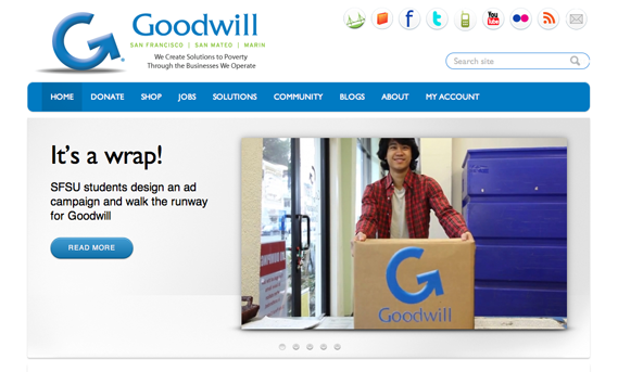
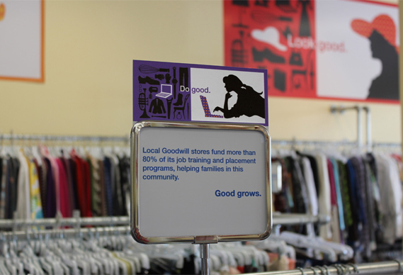
Well, this week while I was surfing around the internet I came across with a work, advertisements of Goodwill, the US social enterprise organisation . It's a community that encourages people to donate what they don't need essentially, and stand for reducing over consuming culture.
The former creative director of Creative Vision Group at Target- Tim Murray joined Goodwill in Sn Francisco and claimed "By providing a second or third use for stylish stuff, Goodwill is one of the reasons the San Francisco Bay Area is one of America's greenest and least wasteful regions.". He enlisted the help of illustrator and designer Craig Frazier to enforce the campaign in the San Francisco area because he wanted a design that is a s strong as target's and something catchy, that people would brandize the 'help'.
 They came up with the big "G" logo which refered to the recycling logo and its suggestion of personal uplift.
Even though they thought it was genious and it's pretty simplistic actually in a good sense just considering the logo type, i believe it lacks of certain attention that they need for their programme. It looks like too official and the shines and shade below the logo in their website kind of disturbs me, can't combine with the typeface of goodwill sign.
"A logo does not a brand make, so we set out to rebuild everything around it," Muray says. They kind of created a new brand expression and related advertising.They made advertisements on their fleet of trucks-lorries which used to look like:


The former creative director of Creative Vision Group at Target- Tim Murray joined Goodwill in Sn Francisco and claimed "By providing a second or third use for stylish stuff, Goodwill is one of the reasons the San Francisco Bay Area is one of America's greenest and least wasteful regions.". He enlisted the help of illustrator and designer Craig Frazier to enforce the campaign in the San Francisco area because he wanted a design that is a s strong as target's and something catchy, that people would brandize the 'help'.
Even though they thought it was genious and it's pretty simplistic actually in a good sense just considering the logo type, i believe it lacks of certain attention that they need for their programme. It looks like too official and the shines and shade below the logo in their website kind of disturbs me, can't combine with the typeface of goodwill sign.
"A logo does not a brand make, so we set out to rebuild everything around it," Muray says. They kind of created a new brand expression and related advertising.They made advertisements on their fleet of trucks-lorries which used to look like:
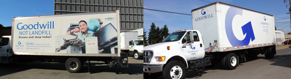
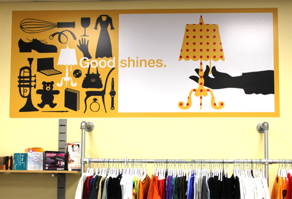
which were considerably visually over crowded. Not beautiful and not appealing for common eyes. The latest image of the lorries that are illustrated by Craig Frazier are like:
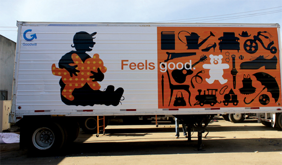
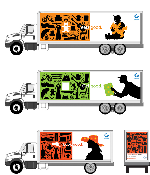
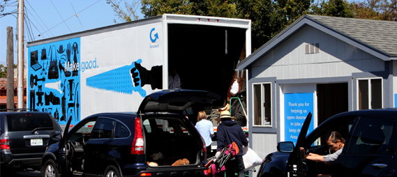
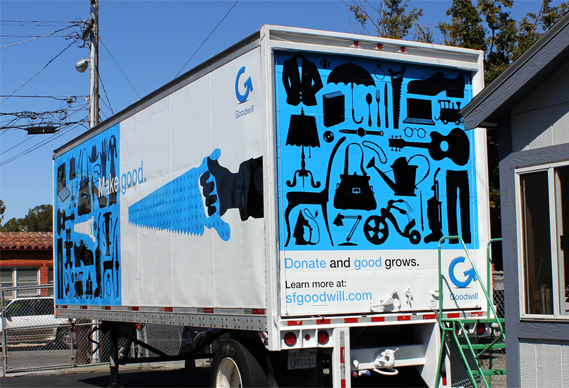
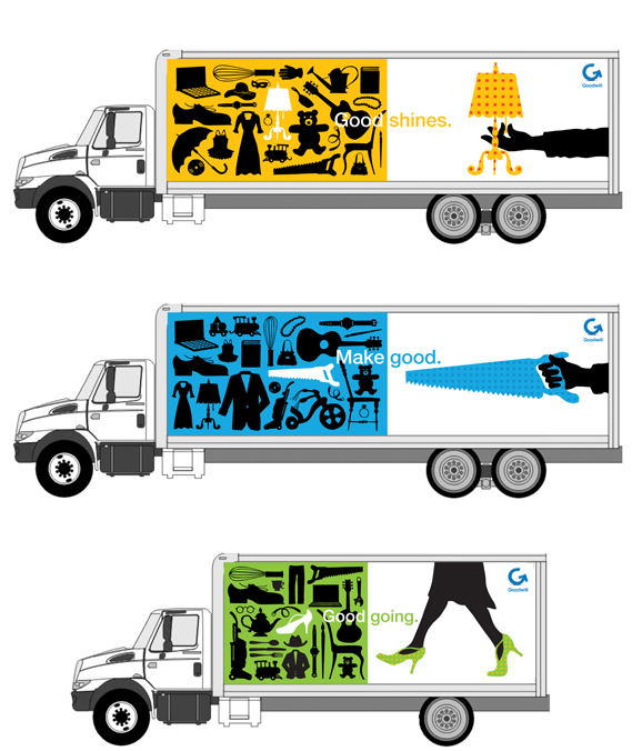
I believe the illustrations are genious. I really liked the idea behind them, although I found the pick up lines too cheesy. The illustrations are too colorful, the typeface and the images match and a high contrast is used that might have disturbed me but didn't. My only problem about his organizing is again the logo type. It looks too dull in this very entertaining illustrations.
1 Ekim 2012 Pazartesi
Not an adventure but hopefully an endless journey
When our T.A told us we were expected to keep a blog about our own design researchs, I thought how much it would help us improve our visual taste and by this task we would feel obligated to research not wait for an appropriate time.
I always thought I would make my living and catch my dreams in music sector. I started playing piano when I was very little, took singing-opera lessons over 5 years, been on stage lots of times and after not a very happy one year experience in the concervatoire, I've decided that being on stage wasn't the thing I have always looked for. I wanted to create new things, design what I'm finding beautiful all over again. And I left everything behind that I was prepared for all these 11 years and I started chasing a thing that I had never been familiar of until recently, the design world. To study 'sound design' and more passionately 'audiovisual design' I had to start over to teach myself the visual language. It's like learning to play a whole new instrument which works in collaboration with our eyes and brains, that most of the people generally not aware of having it during their life times, and understand the real logic behind what is visually beautiful. And understanding that is a hard task for a beginner like me, like trying to learn a new language, I have to go step by step. And most of all, to be able to create the beauty, first I have to learn appreciating the beauty.
That's why in my first post I chose this work of Xavier Villar, because this work was not an corporate identitt in the first place it was his journey like I imagine. It's a work that the artist interactively uses his experience to create his work. And the more his journey matures the more meaningful his work becomes. Maybe I'm not yet to criticize the typeface and design he create but I loved the conceptual soul in his work that's why I wanted to share.The work is called "A 2783 km long dream" and it identifies the designers journey from Barcelona to live in Stockholm. 2783 km is the distance that from his house in Barcelona to Stockholm. It's logo is interactable, that it's not readable on it's own, you have to draw a line to make it legible. And this line becomes his journey.


Kaydol:
Kayıtlar (Atom)