The former creative director of Creative Vision Group at Target- Tim Murray joined Goodwill in Sn Francisco and claimed "By providing a second or third use for stylish stuff, Goodwill is one of the reasons the San Francisco Bay Area is one of America's greenest and least wasteful regions.". He enlisted the help of illustrator and designer Craig Frazier to enforce the campaign in the San Francisco area because he wanted a design that is a s strong as target's and something catchy, that people would brandize the 'help'.
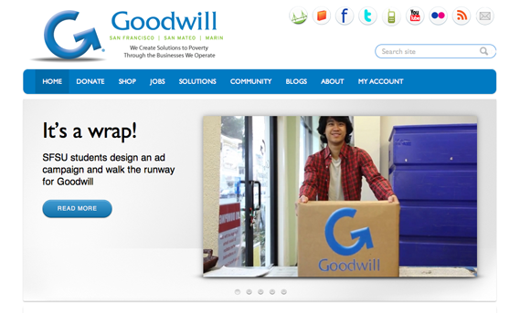
Even though they thought it was genious and it's pretty simplistic actually in a good sense just considering the logo type, i believe it lacks of certain attention that they need for their programme. It looks like too official and the shines and shade below the logo in their website kind of disturbs me, can't combine with the typeface of goodwill sign.
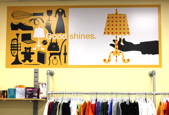
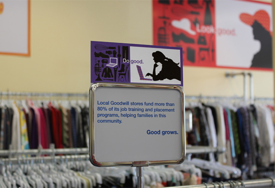
"A logo does not a brand make, so we set out to rebuild everything around it," Muray says. They kind of created a new brand expression and related advertising.They made advertisements on their fleet of trucks-lorries which used to look like:
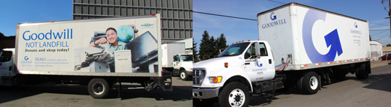
which were considerably visually over crowded. Not beautiful and not appealing for common eyes. The latest image of the lorries that are illustrated by Craig Frazier are like:
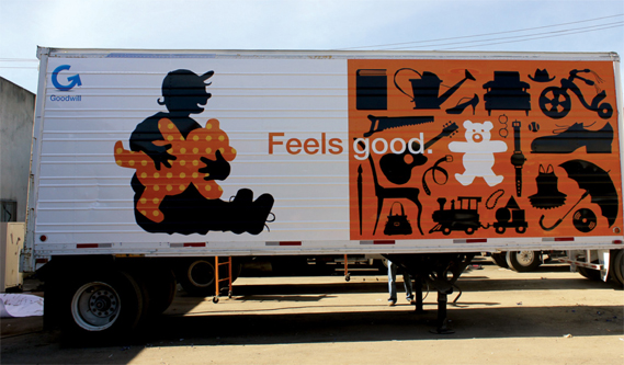
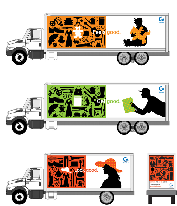
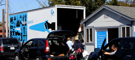
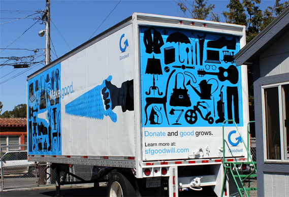
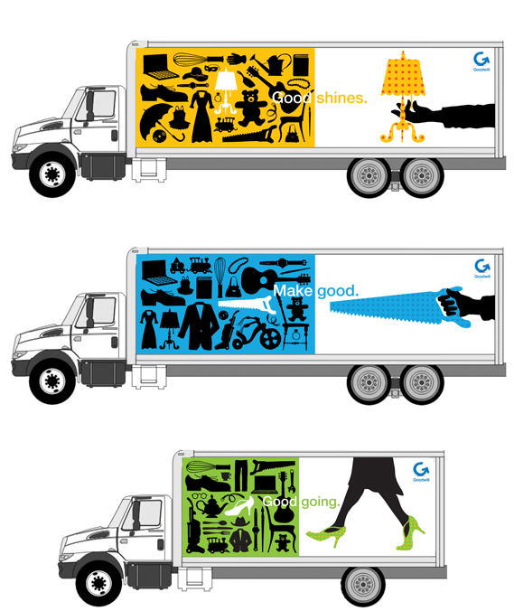
I believe the illustrations are genious. I really liked the idea behind them, although I found the pick up lines too cheesy. The illustrations are too colorful, the typeface and the images match and a high contrast is used that might have disturbed me but didn't. My only problem about his organizing is again the logo type. It looks too dull in this very entertaining illustrations.