This week while I was researching brand logos to inspire my own project, I came across with two of most known brands' and their latest logo works. One is windows(which's logos are mostly controversial.) the other one is Reno that I have kind of grew up not realizing a small change in it's logos. I want to discuss some issues in them.
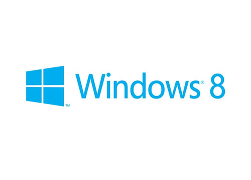
The first one is Windows, since the early ages of my childhood and not knowing English yet, I wasn't able to realize that the logo was representing a window, It simply seen to me as a colorful rainbow like flag. While I was reading the motives why the designer a different kind of logo made me smile because she asked to the principal director of the user experience of Microsoft, "Your name is Windows, why are you a flag?" I think the biggest problem of windows logo was that. It was away from simplicity(specially in 98 case) and to much stylized. The new logo is below:
I really liked the new logo because it gives the feeling of perception, the depth of field and creates a 3D sense and doing all these by not breaking the simplicity. But again there is a problem by escaping the colorful face of previous windows, now the new logo looks like completely different logo type and the recognizable image lost its sense of trustability(maybe I over say but I feel like it) And still the depth of field could still be created by the relationship of cold warm colors and the type wouldn't look that much governmental(which is a problem for a dominating corporate like microsoft)
The previous logos are below:
The second one is the one I definetely adored, because I believe it's genious.
They used 3 layers and 3 different colored diamond shapes(that is the previos reno logo it had parts that divided the diamond shape) The colors and the 3d illustration above gives us the sense of the mechanic and worm characteristic of the car at the same time.
the logo looks like the representation of the car itself not simply a corporate identity brand. The shells that the cars themselve have.


